Astronomers Created a New Interactive Map of the Universe
The full map of the observable universe is actually a slice of cosmos with a thickness of about 10 degrees. However, it still gives an idea of the scale of our universe as well as its stars and galaxies up to 13.7 billion light-years away.

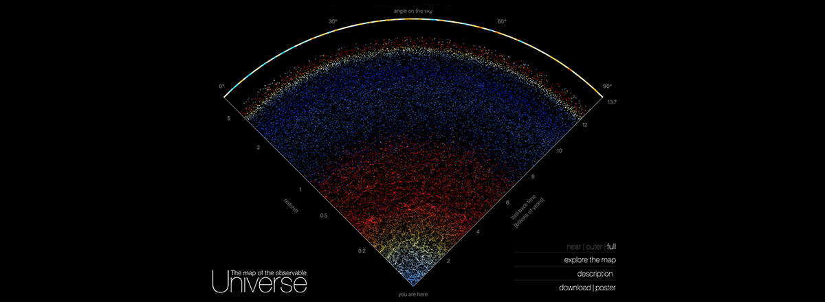
Astronomers from Johns Hopkins University have created a highly-detailed and first-of-its-kind interactive map of the universe that depicts the actual position and real colors of 200,000 galaxies stretching from our Milky Way galaxy to the very edge of the observable universe.
The map is based on two decades of data from the Sloan Digital Sky Survey (SDSS). The work intends to show everybody what the universe looks like and how vast it is.
The full map of the observable universe is actually a slice of cosmos with a thickness of about 10 degrees. However, it still gives an idea of the scale of our universe as well as its stars and galaxies up to 13.7 billion light-years away.
Each dot on the map represents a galaxy, each containing billions of stars and planets. The colors help you navigate the map of galaxies. For instance, the galaxies closest to us are pale blue, which are spiral galaxies about 2 billion light-years from Earth. Then the galaxies begin to turn yellow –at this distance, we still see mostly bright elliptical galaxies.
At a distance of 4 to 8 billion light years, the map turns red and shows elliptical galaxies that are far away from us and are moving even further as the universe is expanding.
Eventually, after a billion light years of almost complete darkness, we reach the edge of the observable universe. More so, the new map shows the first flash of radiation emitted after the Big Bang event some 13.7 billion years ago.